01
Challenge
In order to provide a strategic and visual framework for their diverse activities and subdivisions, loop was tasked to create a new corporate design system for MCube.
Defining and communicating these design standards in a way that enables easy implementation throughout the multilayered organisation - regardless of the user’s skill and toolset - presented the core challenge of the project.
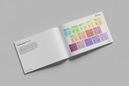
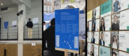
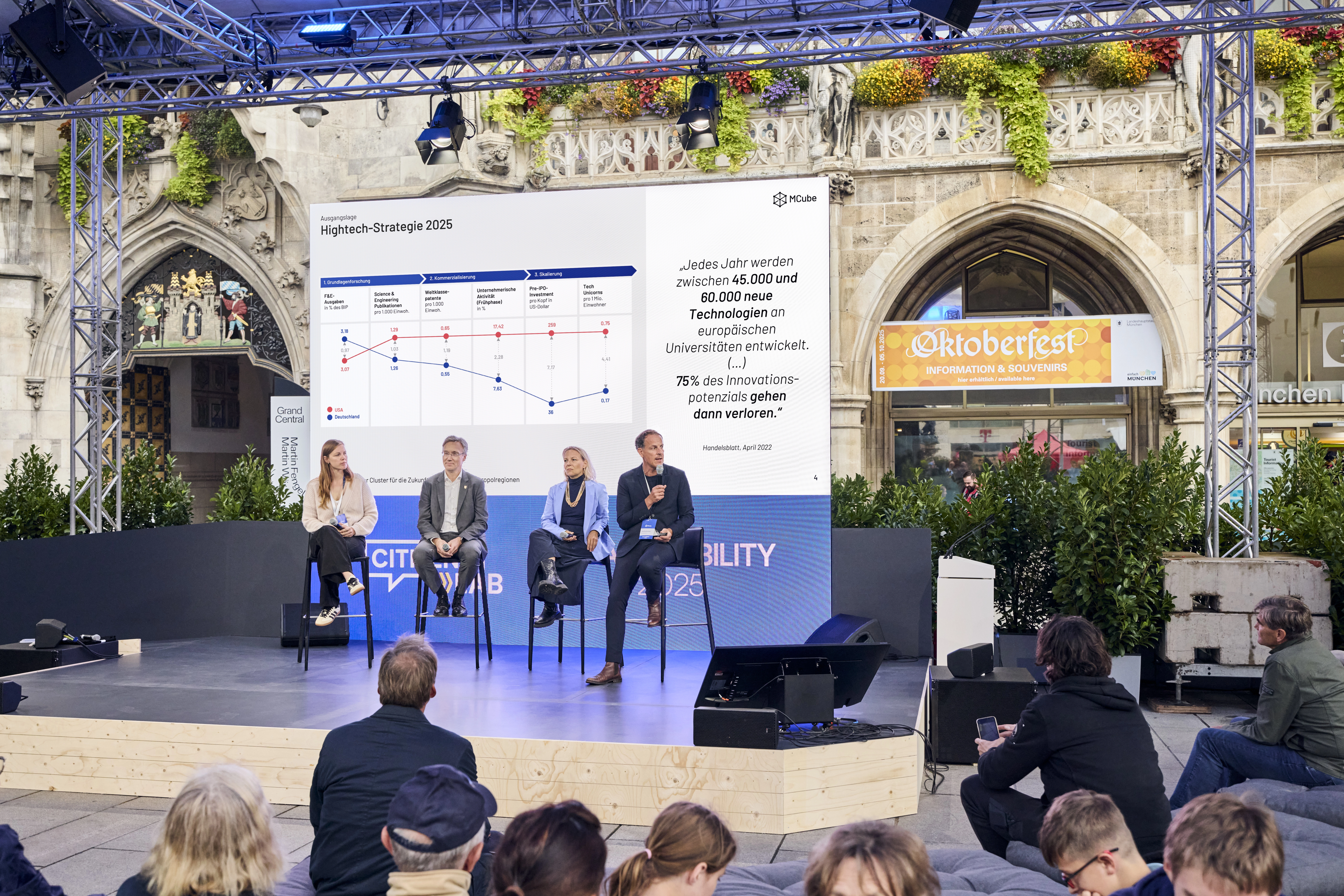
02
Scope
We started out with defining key brand elements like logo, typography, color and image style and providing guidance on their use in a style guide. Subsequently we created layout templates for different communication formats as well as for social media content and supported with developing a coherent storyline and compelling visuals for the company’s pitch presentation.